Is Our Picture of Evolution Still Stuck in the Past?
This year is the 100th anniversary of the Scopes “Monkey Trial” — the first trial to challenge the teaching of evolution in the United States. At the time of the trial in 1925, opponents of evolution based their case on the Butler Act, which prohibited teaching that humans descended from “lower orders of animals” in public school classrooms.
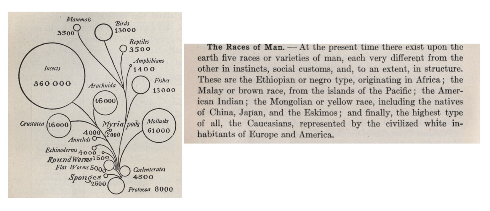
Key to the case for both sides was the state-sanctioned 1914 textbook titled “Hunter’s Civic Biology,” which was published about 30 years after Charles Darwin’s death and 30 years before Darwin’s theory of natural selection was synthesized with then-emergent ideas of genetics (in what is called “the modern synthesis”). Hunter’s textbook depicted mammals as occupying a higher position in an evolutionary hierarchy than other groups (an erroneous progressive notion of evolution) and contains texts about human races that state the “highest type” is “the civilized white inhabitants of Europe and America” (Fig. 1).
These images and statements (which were, again, in a state biology textbook) are antithetical to modern views of evolution and race/ethnicity. And yet we still find today that many evolutionary diagrams depict our species, Homo sapiens, in ways that promote misleading views of humans, particularly with regard to sex, gender, and ethnicity.
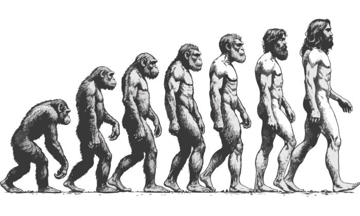
Consider, for instance, Rudolph Franz Zallinger’s 1965 mural “March of Progress.” This mural — which illustrates a linear progression of humankind from monkey to ape to man (redrawn in part in Fig. 2a) — is one of the most commonly used in popular culture today. But it’s incorrect. As Stephen Jay Gould explains in his 1996 book “Full House,” evolution doesn’t lead to humans as shown. Rather, we share common ancestry with other great apes, such as our closest living relatives, the chimpanzees; we did not evolve directly from them.
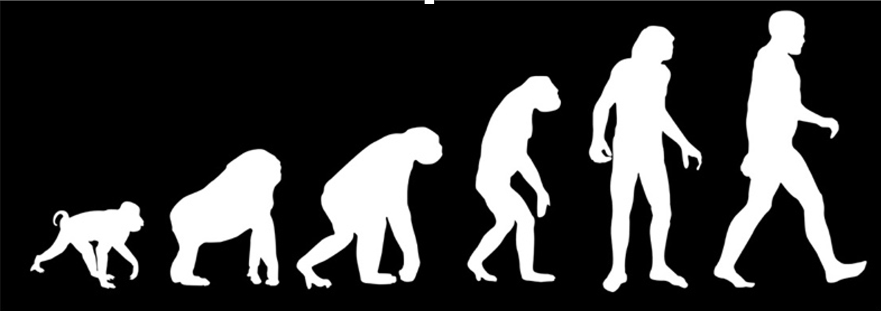
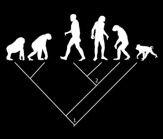
In other words, evolution doesn’t have an end goal. It’s not about one species turning into another until you end up with humans. It’s about adaptive and non-adaptive heritable changes in populations responding to ever-changing environments, more like blind trial-and-error than progress in one direction.
In more modern depictions, humans are frequently represented in phylogenetic trees — evolutionary diagrams showing the relationships among organisms. These depictions are more accurate; however, the human is often represented by a stereotypical nondescript “white man” — and rarely as a woman, child, person of color, or any other figure representative of the diversity of humanity. This problem has persisted since the time of Scopes (and likely before).
Furthermore, humans are often depicted at the far right side, or top, of phylogenetic trees, which can give the erroneous impression that we are the “most advanced” organism (as might be interpreted by the layperson seeing “progress” from left to right or bottom to top — see the figures from Hunter’s textbook again). Yet because phylogenetic trees illustrate “sister-group relationships” (i.e., closest relatives that descended from a common ancestral node), each node can be rotated and the two descendant “sister groups” can be switched in place relative to the ancestral node and still show the same relationships (Fig. 2B). Therefore, humans can easily be depicted in other parts of the phylogeny (versus on one extreme end) without changing the relationships. Depicting humans closer to the center of a phylogeny allows the viewer to reflect more deeply on the meaning of their place within the Tree of Life (i.e., the phylogenetic depiction of life on Earth). We are just another branch in the Tree with no more special a designation than a flea or a cow.
To further examine how the representation of human beings in evolutionary diagrams has changed since the time of Scopes, I recruited an excellent Louisiana State University undergraduate student, Margaret (Maggie) Bagot, to search for images depicting humans in biology textbooks. Maggie went through every biology book in the LSU undergraduate library’s stacks (GN281- GN449.8, and QH301-QH430) and examined all the images she could find of humans shown in an evolutionary context.
In my search with Maggie, we found that most evolutionary diagrams represented all of humanity with a white male when identifiable: 36 male figures were found out of 48 total representations of humans (Fig. 3A). However, there has also been a progressive increase in diversity added to the representation of humans in these diagrams over time (Fig. 3B). Additionally, when humans were depicted in phylogenetic trees or other similar representations of evolution, humans were normally in the top or far right side of the image (ex. left side images of Fig. 3b).

We recognize that this is a very cursory investigation of how humans are depicted in evolutionary diagrams. But we challenge scientists and educators to think about the representation of human diversity and of how a phylogenetic tree may be read or misinterpreted (as progressive) in the ways we generally illustrate them.
In the time of Scopes — when genetics and the mechanisms of inheritance were still only partially understood — racism, sexism, and eugenics dominated the scientific literature, as it does in Hunter’s textbook. One hundred years after the Scopes trial, the field of evolutionary biology has made significant progress. But many people still misunderstand evolution as progressive or goal-oriented, with humans as the ultimate objective. The way we depict humans and other organisms on the Tree of Life impacts how the public understands evolution. Some simple changes in how we illustrate the process, like swiveling a node or two on the Tree of Life, might go a long way toward improving that understanding.
Prosanta Chakrabarty is the Hunter Chair & Professor for Communication in Science Research. He is also Director and Curator of Fishes at the Museum of Natural Science at Louisiana State University. He is the author of the book “Explaining Life Through Evolution.”